Perfect Poppies

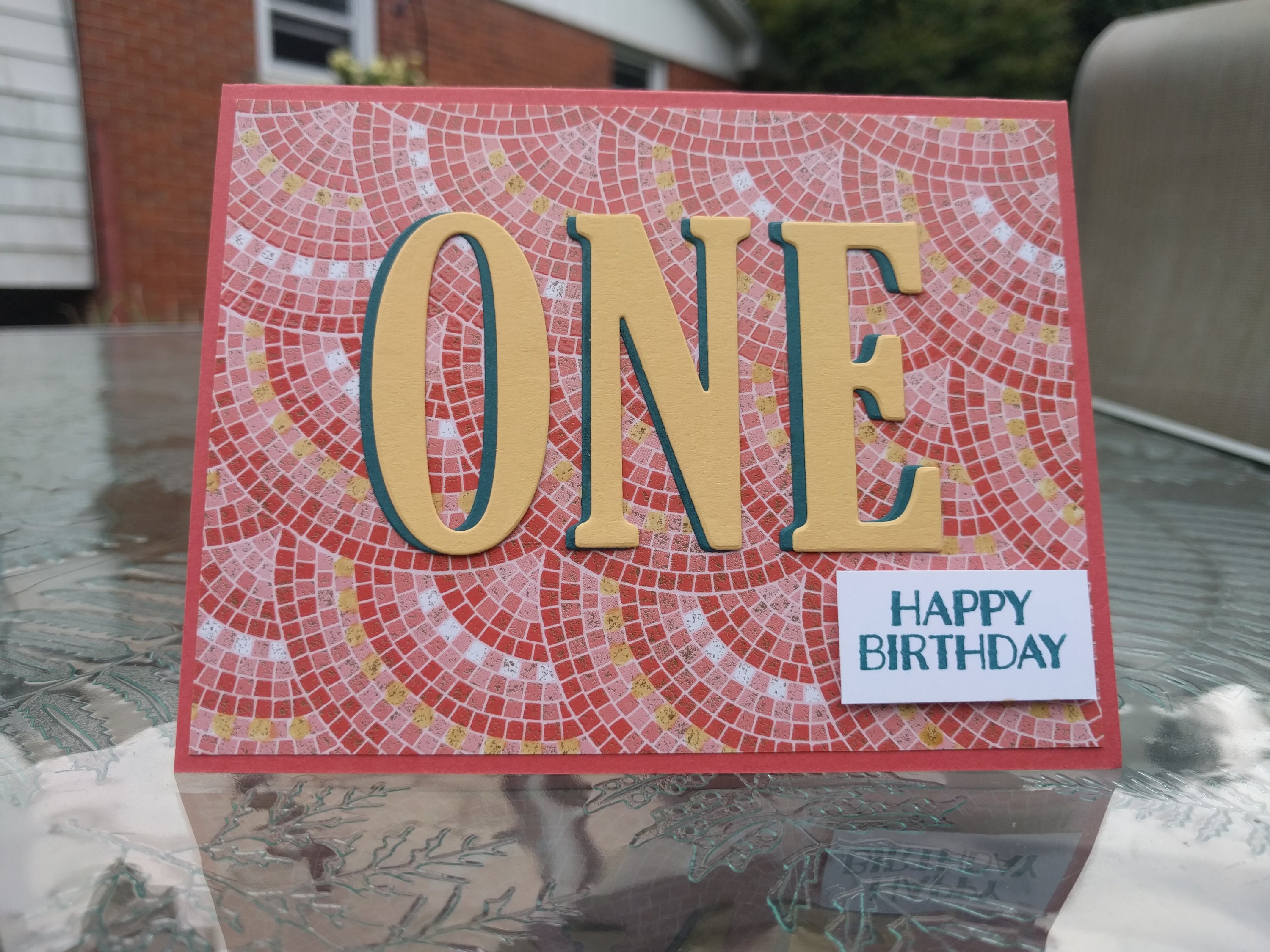
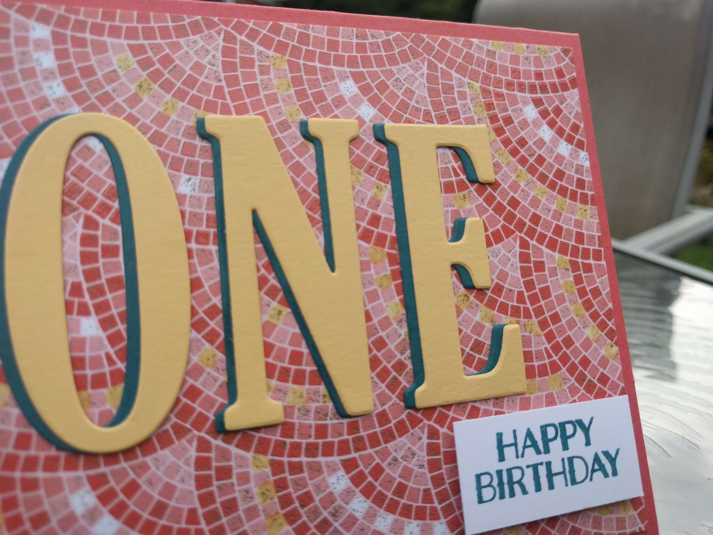
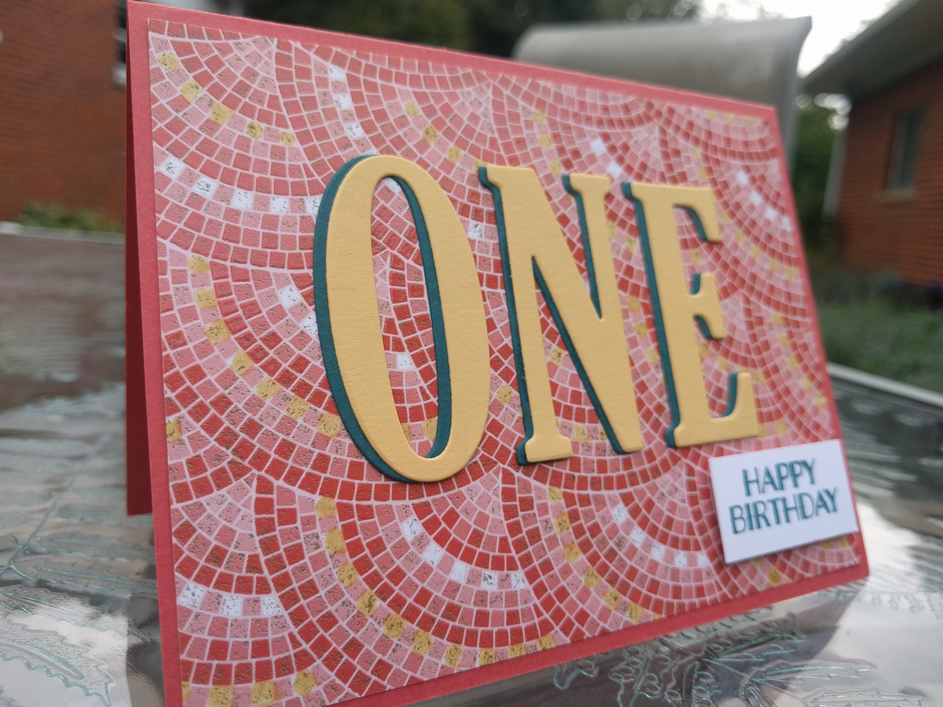
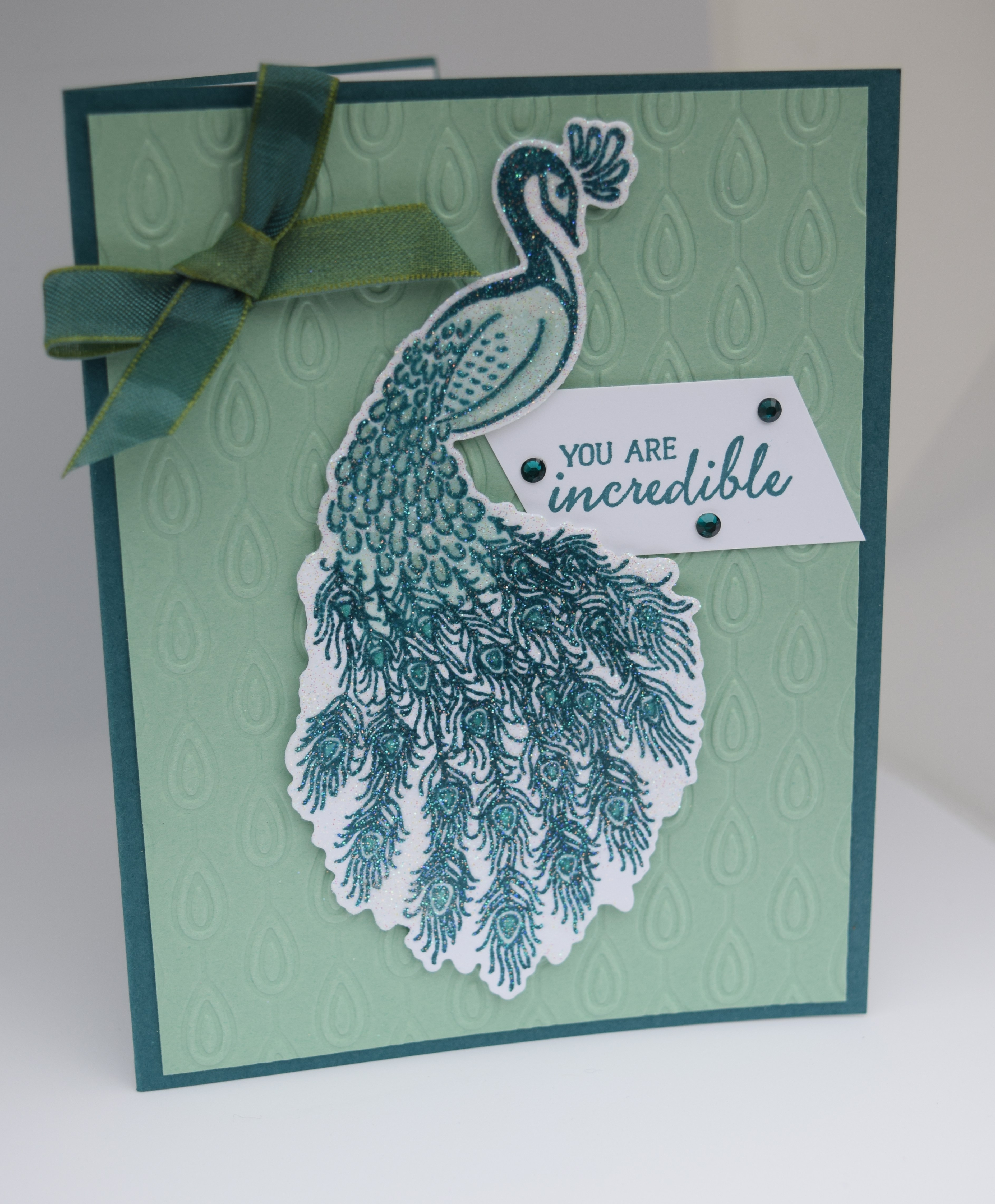
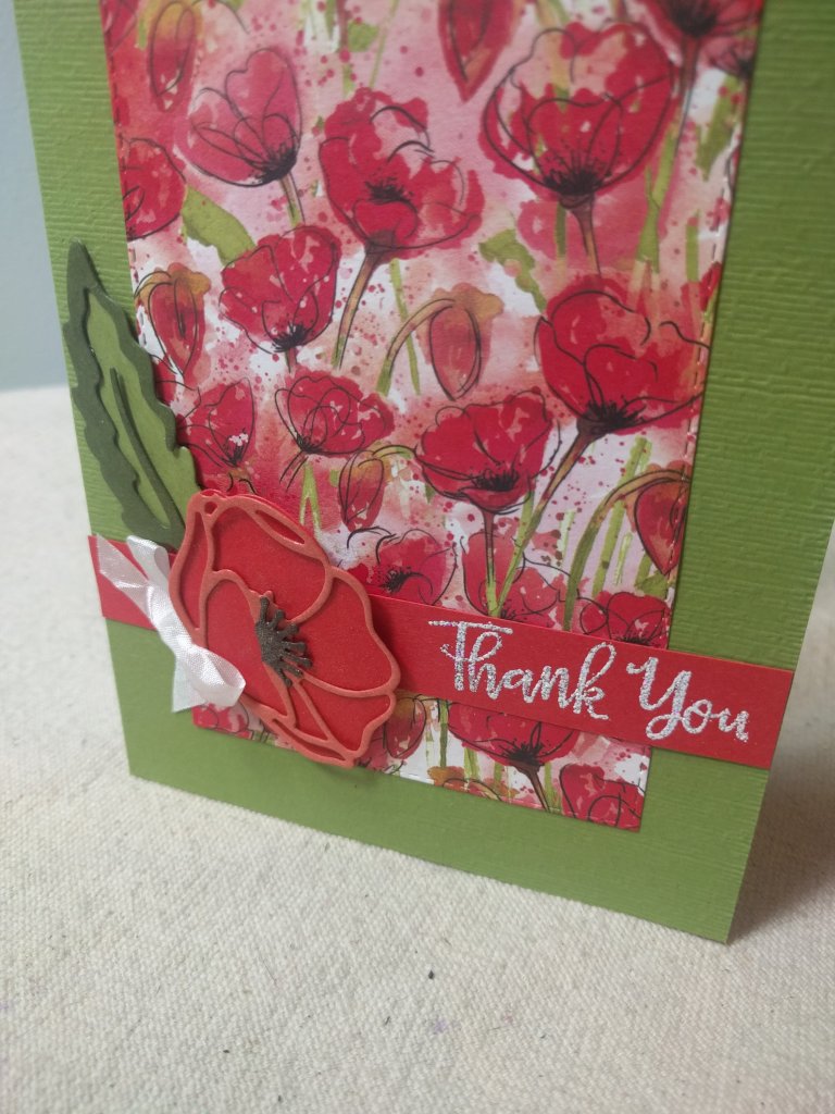
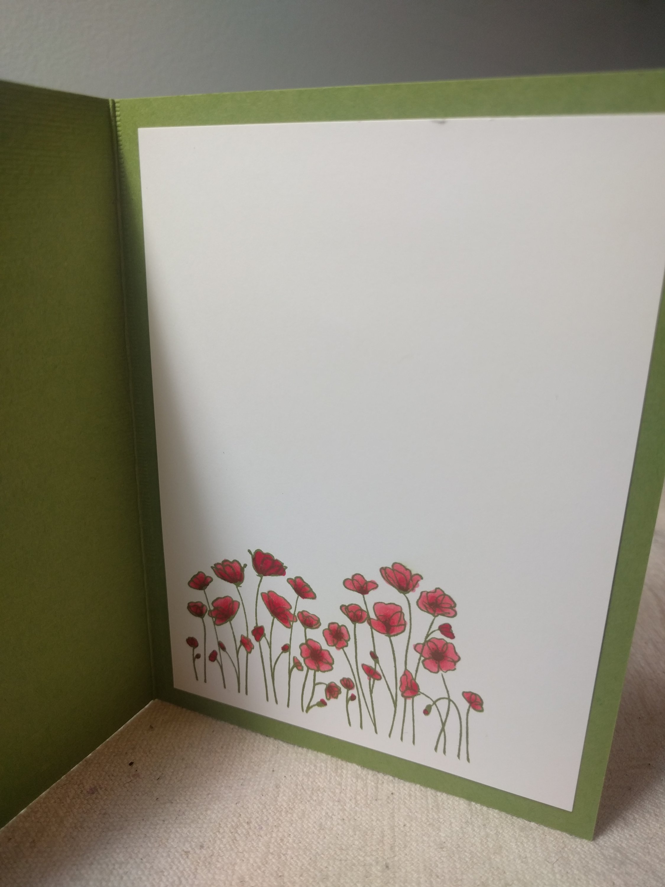
This new Stampin’ Up! Peaceful Poppies dsp is so fun and bright! It was just what I needed on a grey, cold, dreary, Michigan day. These days in Michigan really challenge my motivation (i.e. I really just want to Netflix-n-Chill, aka N-n-C). As I was cleaning just before N-n-C, I came across this designer series paper pack, and my heart started racing. The next few moments were a blur as my fingers started tingling, my brain flooded my mind’s eye with possibilities, breath quickened, mouth went dry, butterflies fluttered in my stomach. It was love, at first touch of this paper. In minutes I was seated at my craft table, paper cutter in hand, trying to keep my thoughts in order to start creating. The T.V. seemed so insignificant, compared to the prospects of creating with this bright, cheery paper! Whenever I get overwhelmed with possibilities and need to focus, I turn to my Bloglovin’ app and start scrolling. I came across a sketch challenge from CAS(E) this Sketch! challenge 353. I used the Subtle 3D embossing folder to give the base of the card a little texture. The red Poppy Parade card has the dsp cut out with the largest Stitched Nested Labels dies and for green Old Olive card the largest Stitched Rectangles dies was used. The sentiment from Peaceful Moments stamp set was stamped with Versamark ink and then heat embossed with shimmer white embossing powder. This was my first time using the shimmer white embossing powder and it gives a very nice shimmer with some silver specks in the powder. The cut out flower and leaf are from the Poppy Moments dies. The cut out flower on the Poppy Parade card is a Flirty Flamingo base with Poppy Parade outline. The cut out flower on the Old Olive card is a Poppy Parade base with Calypso Coral outline. I did cover the cut out flower and leaf with clear Wink of Stella, but it is very hard to photograph. All products purchased through Stampin’ Up!.

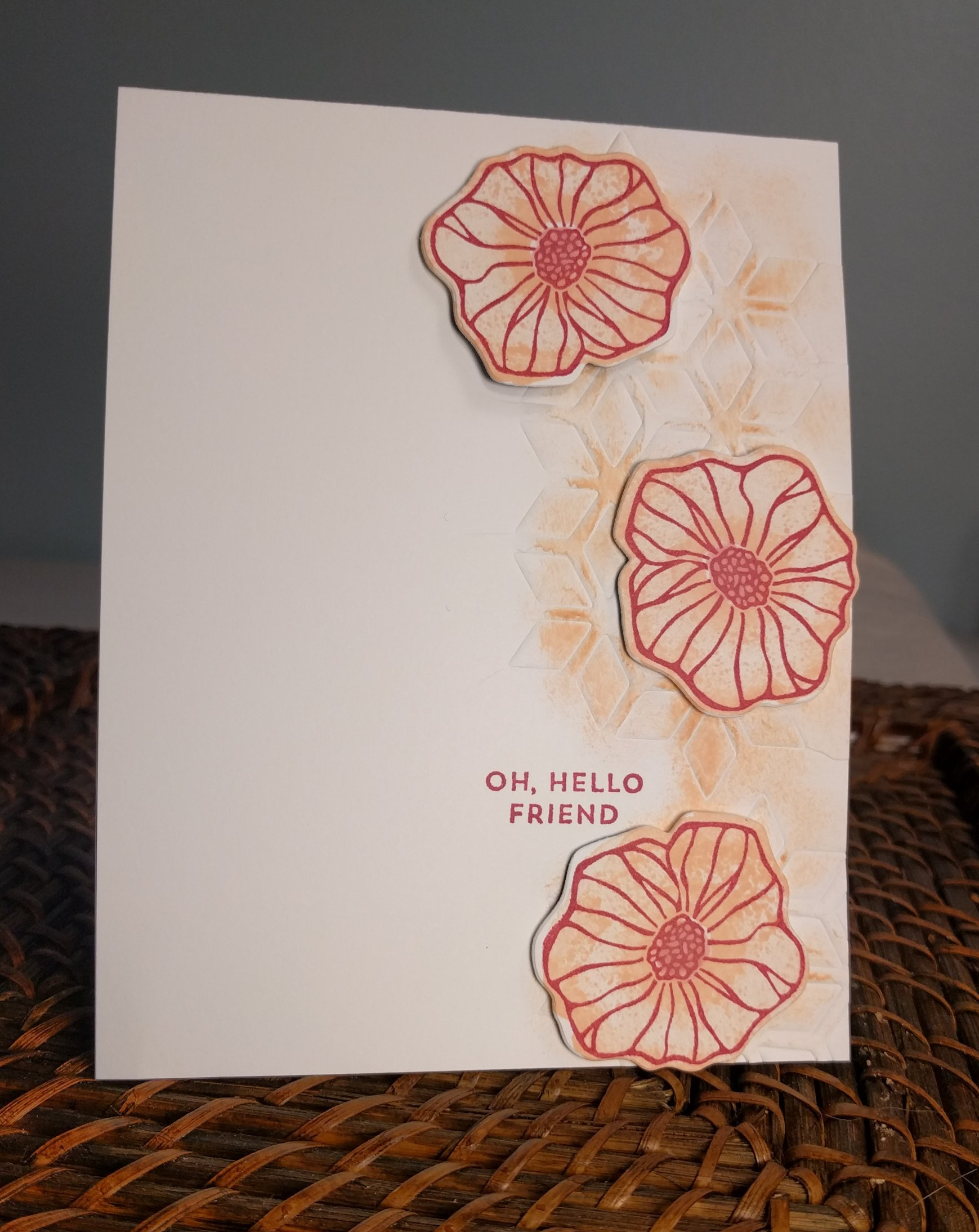
Stamp from the Painted Poppies stamp set, stamped in Old Olive and colored with Poppy Parade light and dark blends.

Photo Perfect Paper

Today was my first time playing with the Pressed Petals Stampin’ Up! Designer Series Paper. The DSP has photographic images of real pressed flowers. I always try to make my own pressed flowers, but they never turn out as beautiful as this paper!  This card came together fast using the Band Together stamps and Detailed Bands dies. I love the delicate texture of die I used on the inside sentiment. I think that is the most used piece ever out of all the dies! This was my first time using the die shape for the front, and I think that is my second favorite now.  I always layer cardstock on the inside of my cards, but the challenge at My Time to Craft Challenge #407 Inside Out! was to decorate the inside of the card. So I obliged. I enjoy checking out lots of card challenge blogs for ideas, and when I saw Addicted to Stamps and More ATSM#361 Anything Goes, I was excited to be able to enter the challenge.  Again, I am so in love with the paper, I can’t bare to hide it under any more than a sentiment. Having the sentiment as the focal point (besides the stunning DSP) was an idea I gathered while checking out Sweet Stampers Challenge #36 Use a Sentiment.

img_20191004_1636538117092021669507664.jpg

img_20191004_1637046595692485677284314.jpg

Number Fun with One

I now regret not buying the Stampin’ Up large number framelits! I try so hard not to look back with regret for not buying something before it retires, but those numbers! I didn’t even want to make a “number” card before the last few months (of course, AFTER the numbers were gone). Well, I am glad I did grab a set of the large letter framelits! I used the current Mosaic Mood Speciality Designer Series paper in Terracotta Tile and colored in some of the white squares with my So Saffron marker. The darker layer of the “ONE” is Pretty Peacock, with the top layer being So Saffron. This color combination is brought to you by CAS Colours & Sketches Blog #339 (Terracotta Tile, So Saffron, Pretty Peacock). Seize the Birthday challenge #174-It’s just a Number and Daring Cardmakers-Got Your Number challenge  had me reaching for the number framelits (that I don’t have!), so I improvised with the word “ONE”. I needed a card for a friend’s son’s 1st birthday and I don’t have any “baby” or “kid” stamp sets. I am pleased with how this turned out and can’t wait to “WOW” the 1 year old (hahaha, ok, WOW the parents!).


Our Badge  Daring Cardmakers

Incredible Peacock

There have been a number of different peacock images over the years that just haven’t caught my eye like this one from the Noble Peacock stamp set (cut out with the coordinating dies). The Beads and Baubles embossing folder adds just a little background for my incredible Peacock. This was designed for the Just Us Girls challenge #491-Color week. The color challenge was to use Light, Medium, Dark tones of any one color.  I first stamped the peacock in Pretty Peacock (dark) and then used the light and dark Mint Macaron Blends (light & medium) to color. There is a little Bermuda Bay colored in the middles of the feathers at the bottom. I used then used ice embossing powder to give the peacock an overall shimmery look.

Pretty Peacock with ice embossing powder

My Pretties

I got some new Stampin’ Up! goodies Friday evening, so I just had to make time to try them out this weekend. The new in-colors are a welcome addition to all the color families! I focused on the new greeny-blue color Pretty Peacock first. For inspiration, I looked to Freshly Made Sketches FMS#392.

The little “You did it” sentiment is from the Royal Peacock stamp set. The paper is from the Noble Peacock specialty DSP and Noble Peacock Foil sheets. I love this color in the foil! I couldn’t add anything else to this card for fear of covering up the gorgeous design.

You did it Pretty Peacock


Eclectic Pink

Wanting to participate in another CAS challenge, I starting working on keeping it simple card #2. I really liked this design, which was inspired by the CAS(E) This Sketch challenge I mentioned in my last post.  Addicted to CAS #151 challenge “Friends” caught my eye as I don’t always make more general “Hello” type cards.    I used “Oh So Eclectic” stamp set, which I have not really used before. The color challenge at The Card Concept #106 Pink Party got me seeing pink. Lovely Lipstick for the outline of the flower, Petal Pink for the shading, with Melon Mambo for the middle seed area. After cutting those out with the framelits, I thought they looked bored on their own. So I decided to figure out how to use embossing pads to emboss a framelit/thinlit shape without cutting it out. It worked! I sponged a little Petal Pink on the diamond impression and adhered the flowers with dimentionals. img_20190121_0636052338826585662049501.jpg

The “Winter Blues” Butterflies

We have had some snowy, grey days lately. Even though I got some fabulous new Stampin’ Up stuff for Christmas, I was feeling a little blue and uninspired. For inspiration, I found a few challenges that intrigued me. The general layout of the card is from CAS(E) This Sketch #305.  Every week, I stare longingly at all the beautiful clean and simple cards, knowing there is nothing “simple” to designing a CAS card. These are, by far, the hardest cards to design. It is easy to have “WOW” factor with glitter, sequins, 6 layers, ribbon, dry embossing, heat embossing powders, foil paper…I could go on for hours! But to let the ink and stamps shine, to let them do all the “WOW”ing?? Very difficult.  I went through 10 pieces of card stock, multiple stamp sets, many different colors, and hours of my time.  To help with limiting my colors, I looked to The Color Throwdown challenge ctd526. The blue and aqua, with white, was just the color palette my “winter blues” needed. I did indeed first see snowflakes, but I am kind of burnt out on snowflakes (6 inches outside, too many snowflake holiday cards). Color challenges really help me focus on a few colors, instead of being overwhelmed by all the colors at my fingertips. I went with Blueberry Bushel and Coastal Cabana for the blue and aqua. In scrolling through my Bloglovin’ page, I came across the Just Add Ink challenge to “Just Add Something New”.  I was excited to try out the new Butterfly Gala stamp set, so this was the perfect impetus to do so! I tend to gravitate towards flower stamps when I need some simple images. But I didn’t have any “new” flower stamps that were working with this design. Staying focused on “new”, I finally got to the butterflies, and I am in love! The two step butterfly images allowed me to focus just on Blueberry Bushel and Coastal Cabana. I sponged a little Coastal Cabana lightly over the area where the butterflies are stamped. The Coastal Cabana butterfly insides are stamped off once to get a lighter aqua hue. This card has made my “winter blues” take flight, along with those pretty little butterflies!

blue butterflies

Joy with Non-Traditional Holiday Colors

Lovely Lipstick, Blueberry Bushel, Grapefruit Grove, Tranquil Tide. Non-traditional Christmas colors for Addicted to Stamps challenge #169, here I come! I have to give my up-line Julie Freysinger 100% creative credit on this card. She taught the technique in class, using the little snowflakes from the SU! Snow is Glistening stamp set to make a wreath. The only changes I made from the card we made in class were the colors.

Joy


Making the Season Shine!

These darling little bulbs are seriously my absolute favorite!! The Christmas Bulb Builder punch makes cutting out the bulbs a snap, but there is some assembly required. It is a task that is great to do while listening to music or watching a movie for the 10th time. I am thinking I will finish up my series of cards with this design while watching “Elf” for the 100th time! This card was created for the 52 Christmas Card Throwdown CCT42-18 and the SU! Only Challenges 212 “Anything Christmas” challenge.

The 52 Christmas Card Throwdown challenge was to pick a previous challenge from 2017. I found the rainbow color challenge from July 15, 2017 very inspiring! The challenge was to use 5 or more colors of the rainbow. I picked SU! Poppy Parade, Mango Melody, Call Me Clover, Blueberry Bushel, and Gorgeous Grape.

Merry Christmas

Shiny and Sparkly

I am normally drawn to sparkly glitter paper and shiny foil, but the holiday season makes it so much more tempting to cover everything in glitter and foil! This card was inspired by 2 challenges: Sketch Saturday #540 and Sweet Stampin’ Challenge Blog Sparkle & Glitz (anything that shines).  The copper and red glimmer paper add the something sparkly with the copper foil “Happy” die cut & copper heat embossing powder on the “Holiday” + inside sentiment, and copper foil stars on the DSP, bring the shiny!