Hey, there!

When I need some focused inspiration, I look for color challenges. This week’s Color Throwdown challenge #717 with mustard yellow, pink, and green inspired this adorable camping card. I have fallen in love with the “Canned Ham” type vintage trailers, so when this Tree Lot Dies was available during Stampin’ Ups! July-August Sale-a-Bration, I had to have it. Dies with all the little pieces like this can be overwhelming, but really once the pieces are cut, it comes together quickly. Definitely need to use adhesive sheets on the detailed die cuts to keep your hands (and card!) from becoming a gooey glue mess! Mossy Meadow & Garden Green make the trees. Crushed Curry for the lights. Blushing Bride added just the right pink accent to the little trailer. When I make cards just because (not for a specific person’s birthday, or thinking of you for someone specific), I never know what kind of sentiment to use. I used Charming Sentiments for a neutral “hey, there!” sentiment. I just love the script for the words in that stamp set.

Tree Lot Dies, Sale-a-Bration item July 2022, now retired. 😦

Charming Sentiments and coordinating dies are currently available in the SU! Annual Catalog.
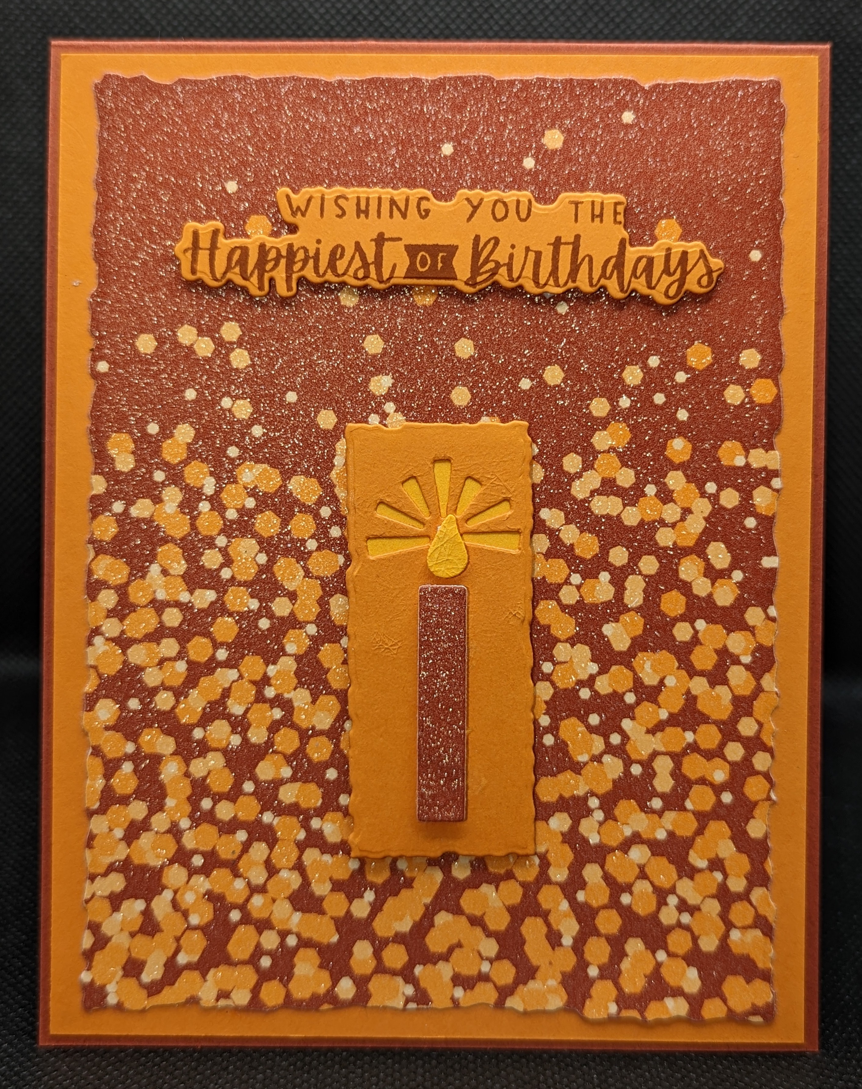
Masculine Metallic

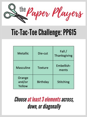
Making masculine cards is so hard for me. Looking for inspiration, I turned to a few card making challenges that I enjoy playing along occasionally when I have time. I had been thinking the current Seize the Birthday challenge #250 with toppings “Halloween colors” when I came across the Paper Players PP615 Tic-Tac-Toe challenge with “metallic”, “masculine”, and “orange/yellow” in the same row. Hmmmmm…..I just knew I had seen some metallic orange paper somewhere in my stash…..hmmmm…. Oh YES! In the Metallic & Shimmer speciality paper pack by Stampin’ Up. When I first opened this paper pack, I had no idea how I would use the metallic orange sheets. But the card was starting to come together in my head! The sheet I used is Cajun Craze and Pumpkin Pie. I had looked at this sheet for Halloween cards because it is the perfect pumpkin color combination, but I didn’t have any Halloween pumpkin stamps (need to fix that next Halloween season!). This festive paper certainly has a “birthday” feel to it! This card is for my husband, and I am so happy to have my his card done weeks before his birthday (versus on the eve of his birthday!). The stamp set Charming Sentiments and coordinating dies are a new favorite of mine (SU!). I love how the dies cut the words out and the candle dies are too cute! I used Mango Melody for the yellow flame. I used the Deckled Rectangles dies for the two smallest rectangles. I have been trying to make cards in multiples to build up my stash, so I made the Beyond Grateful card with the same items. I just used a small scrap of Cajun Craze behind the sentiment.

“SIP”-Stamps, Ink, Paper

Free time to play with my crafts! Yes please! I am always looking at clean and simple type card challenges to find inspiration. Due to my obsession and hoarding of designer series paper, I have a hard time NOT layering pretty paper onto a card base with a simple sentiment. I am on a bit of a designer paper overload, so I really wanted to take some time to focus on “stamps, ink, paper”. As I was sipping my coffee and thinking about SIP cards, I perused a few clean and simple card challenges. Two card challenges that inspired my clean and simple card are Less is More and Addicted to CAS. These sites are great for inspiration. I just admire the beautiful “clean and simple cards” all the talented card makers out there can make (and boy, do they make it look easy!).

Less is More #476 “Use a Stencil”

Addicted to CAS #232 card challenge “Sympathy”

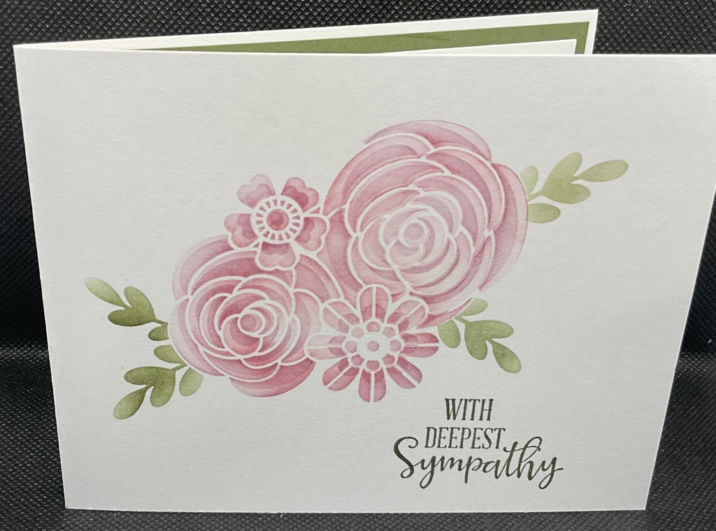
The big hurdle for me was that clean and simple cards really take WAY more time to create the initial design than my “slap on some pretty paper and go” cards. I had purchased some Stampin’ Up stencils “Butterflies & Flowers” and after staring at the stencils for 6 months, this card design popped in my head. I used retired Perfect Plum and Blushing Bride for the flowers. Always Artichoke (retired) just seemed like the right green for the leaves and sympathy sentiment. The sentiment is from SU! Peaceful Moments stamp set, one of my favorites.

The stencils have two pieces for the flowers. I did the first layer in Blushing Bride and the second in Perfect Plum. I wanted soft, subdued colors, for this sympathy card.

This card was ShowCASed for the LIM challenge!

Time to make Christmas cards!

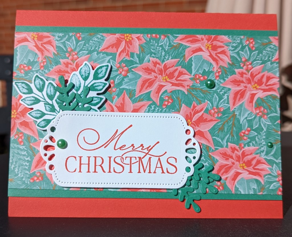
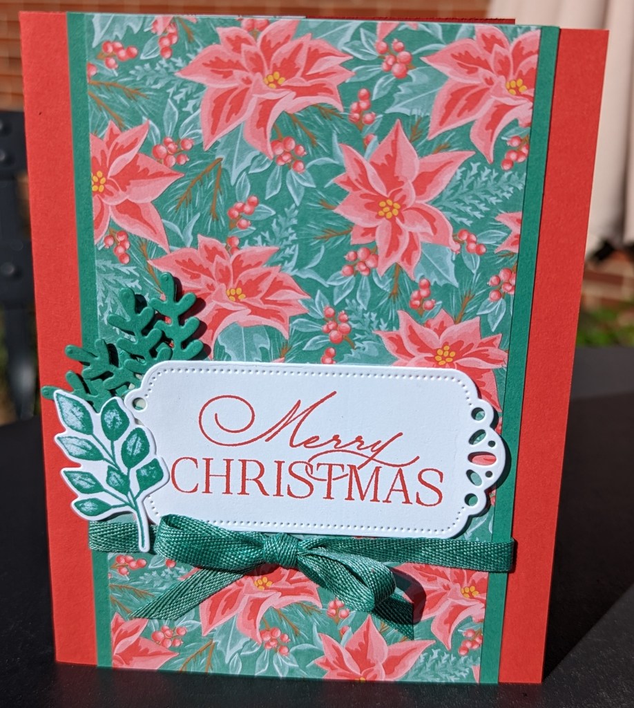
Having some time to craft, I found myself in need of inspiration. I have been busy so my craft area has gotten a little “overgrown” and was overwhelming me. To help me focus, I turned to different card making challenge blogs I like to follow. Perusing different challenges, I found a spark of creativity from the Global Design Project #GDP366 sketch. I have such a hard time covering up beautiful patterned paper and I have vowed to work on my paper stash this month, so this sketch just clicked for me!!! I had just a few sheets of Stampin’ Up retired “Flowers for Every Season” paper to use up that were the Christmas season patterns. I used Forever Fern stamp set/coordinating dies to have some little leafy elements to decorate the sentiment. I colored some pearl embellishments with my Just Jade blends for something extra. I always plan to be the person who starts making holiday cards during the summer, but I just can’t even think about Christmas until the weather gets a little cooler here in Michigan. Every time I’m in my craft area, I tell myself “Time to make Christmas cards!”. But then I remember a birthday that I need a card for or find some paper I want to use up, and I get distracted. Atlas, this paper pack is one that I have been using up this week, and the weather is finally “cool”, so today really was the time to make Christmas cards!

Just Jade and Poppy Parade are beautiful together! I can’t say I have used those colors together before (that I can remember!).
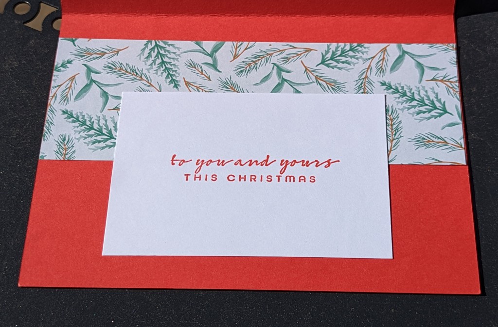
Using up scraps of the 6 x 6 inch paper on the inside.
Turned the sketch on it’s side.

Easy Artist

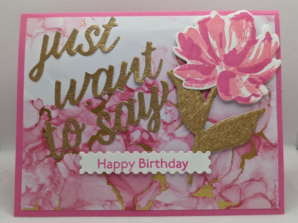
Stampin’ Up! products allow me to be an easy artist! I put this card together in about 5 minutes flat. The Expressions in Ink designer series paper adds the artistic element I wanted for this card without having to dabble in alcohol inking! This paper is stunning, it was hard to cover it up with the flower and die cut words from the Art Gallery stamp set & dies. Magenta Madness swirls on the dsp with gold is so beautiful . The flower is stamped in Polished Pink and then Magenta Madness. The words and leaves are brushed gold paper from the Gold & Rose Gold Metallic speciality paper. Inspiration came from the design team over at Just Add Ink #597 for the Chose 2 Flower-Paper-Pattern challenge. My two favorite elements, paper and flowers.

Butterflies Flitting By

Spring time makes me look for butterflies! I have not seen any yet in Michigan, so I made some appear in my craft room. Butterfly Gala and the coordinating SU! Punch have been retired for a few years now. I love the pretty patterns, which I simply colored with watercolor pencils. The colors are Granny Apple Green, Gorgeous Grape, Crushed Curry, Melon Mambo. I love how the butterflies look like they are flitting by in the breeze on the second and third card. I was inspired to make these cards with 2 challenges. Paper Craft Crew Horizontal Sketch Challenge PCC464 and Retro Rubber Challenge 179 Groovy Baby! 60’s colors Bright Pink, Bright Green, Bright Purple, Bright Yellow.

Conversation Hearts

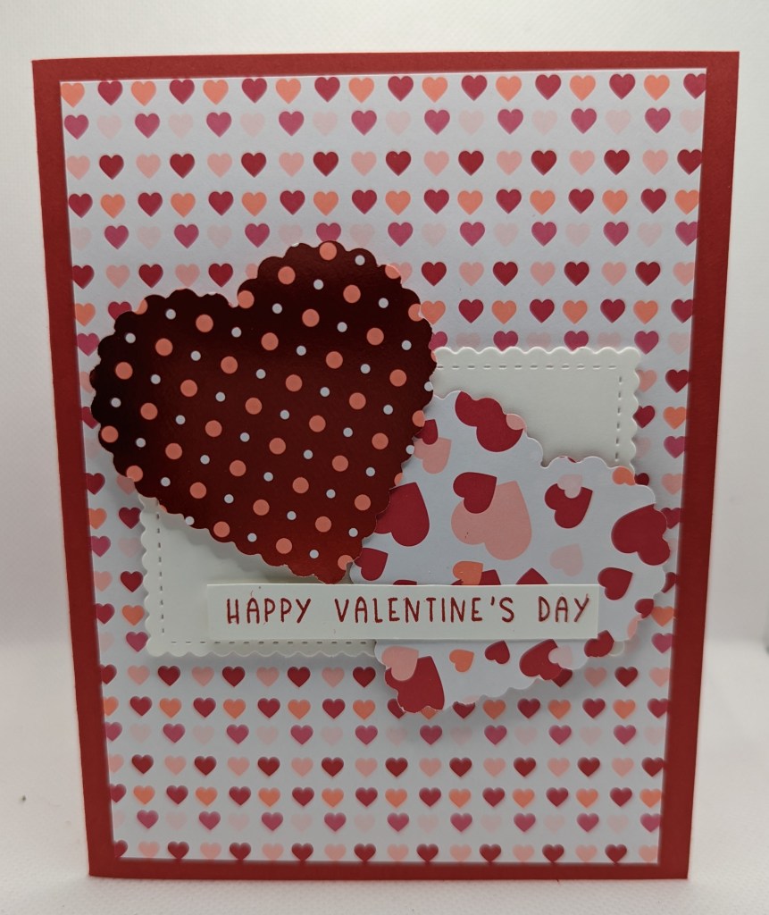
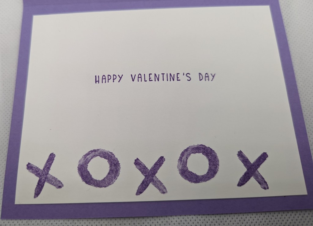
This year Stampin’ Up! has the cutest Valentine’s Day stamp set, dies, and designer series paper. I loved conversation heart candies as a kid! I loved picking out the perfect sentiment to give to my friends! I remember my favorite saying being “Call Me”. I see that has been replaced with “TXT Me”. I have not had conversation heart candies in at least 20 years, so I don’t even know what all the other sayings are nowadays. I should pick up a box on Tuesday! HA! I am sharing this card on SUO Challenges #295 Valentine’s Day Challenge. I love the inspiration this challenge site always gives me.

Simple Sponging for Hint of Color

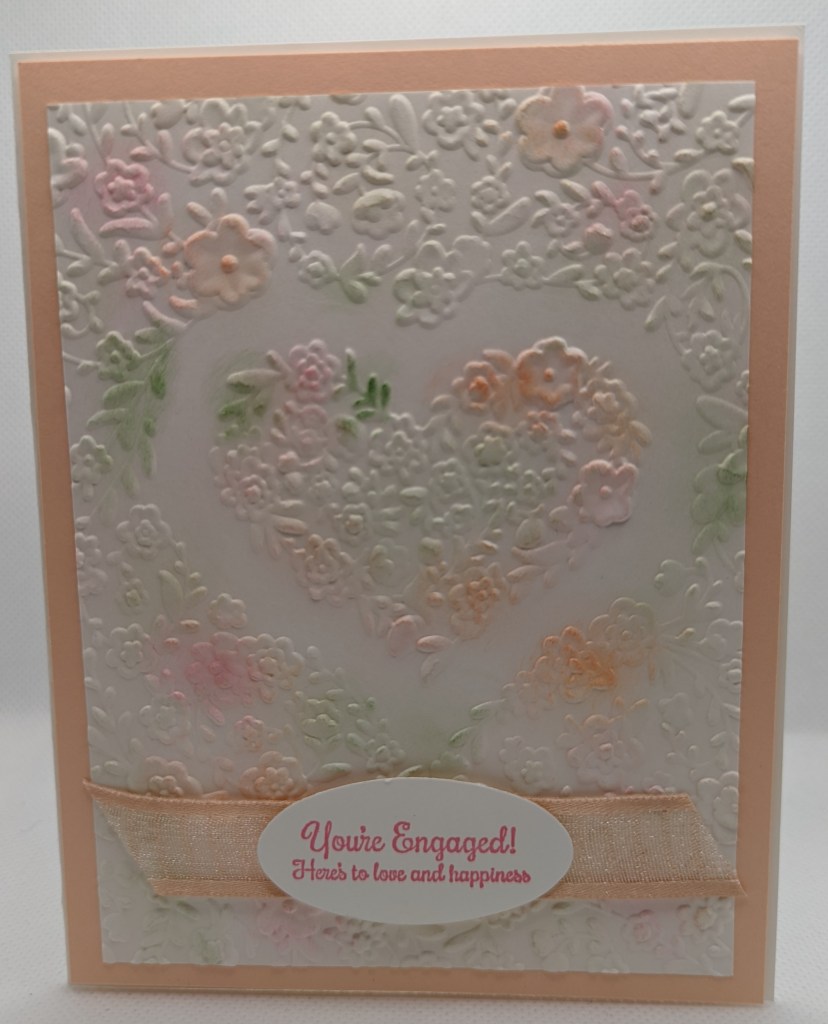
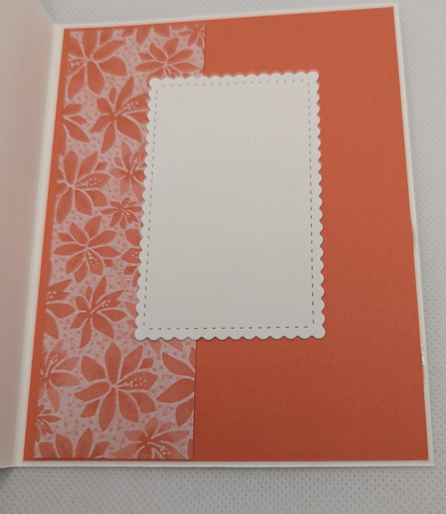
The The Card Concept #168 “Love is in the Air” had the prettiest inspiration picture for this challenge! The white wall reminded me of an embossed background, and I really liked the soft, pastel pink, mixed with a brighter pink and green. Within a few minutes, this card came together with the Bouquet of Love Hydrid Embossing folder embossed on Shimmer White card stock, lightly sponged inks, and the Love & Happiness stamp set for the sentiment. The sponged inks are Petal Pink (soft, pastel pink), Polished Pink (brighter pink), and Garden Green. The sentiment is stamped in Polished Pink and punched out with the Ovals punch. The embossed & sponged Shimmer White piece is mounted on Petal Pink card stock, then glued to a white 5.5 x 4.25 in. card from Thick White card stock.

I kept the sponging very light and random in order to not lose the white space. The inspiration photo had a lot of light and white space to it, which really drew me to the image. I wanted the card to have “hints” of color in order to stay light and airy.

All products Stampin’ Up!.

Rare Finds

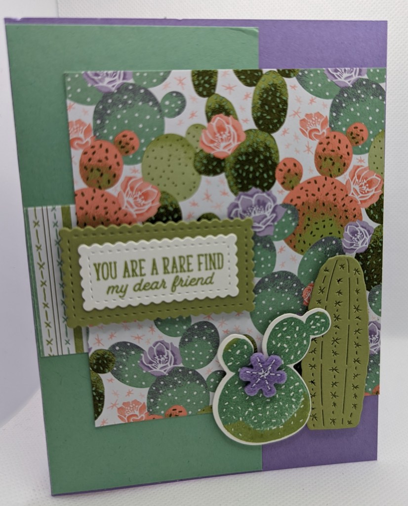
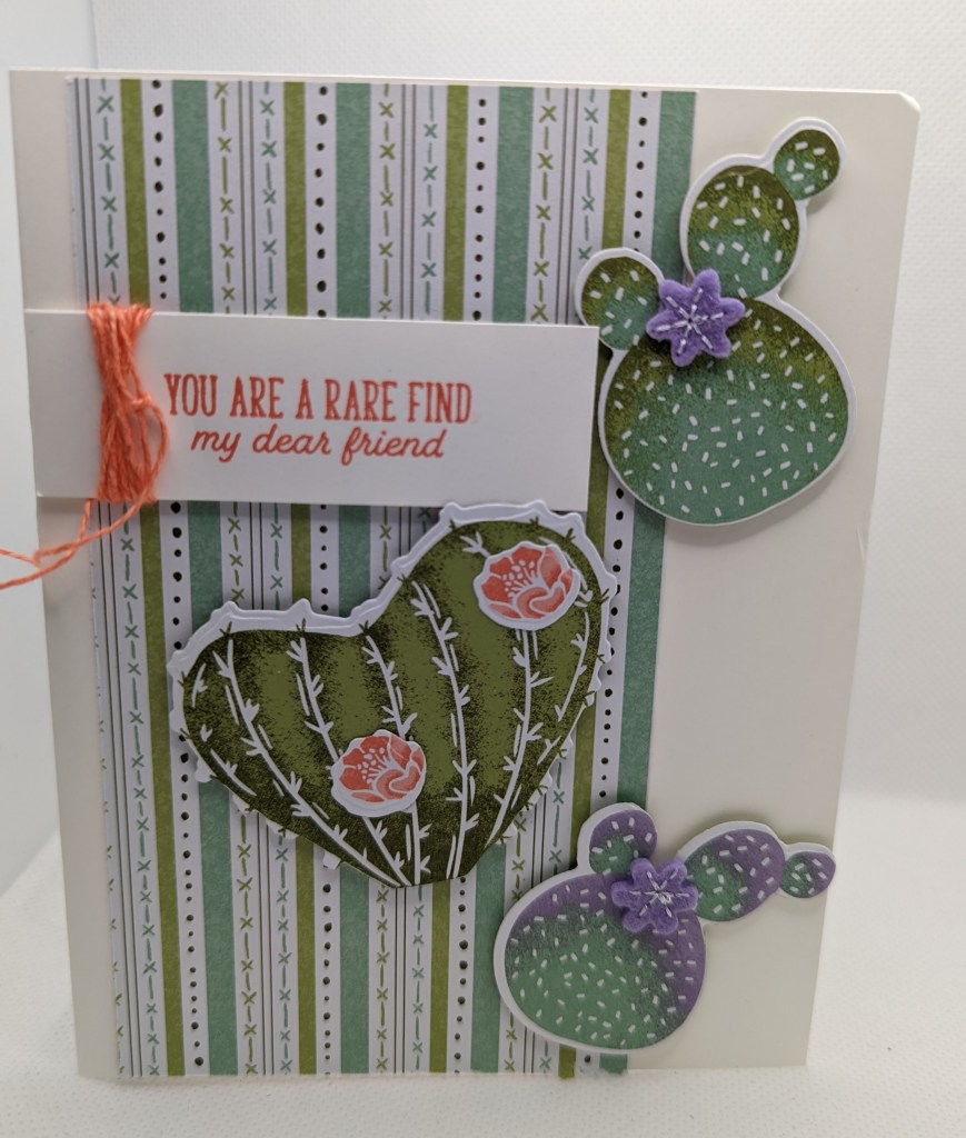
Just Us Girls Challenge #618 has “Friends” for the word challenge this time. As I was scrolling through the projects the design team posted, I remembered I had purchased the Flowering Cactus stamp set for the “You are a rare find my dear friend” sentiment. I am fortunate enough to have a few friends in mind for that stamp set. I dug into my retired stash and found the whole medley (rare find as I forgot I purchased the whole medley). The designer series paper and the stamp set with coordinating dies, have beautiful flowering cactus images. During one of our trips to Palm Springs, CA, I learned just how rare a flowering cactus is and just how stunningly beautiful the colorful flowers are against the desert backdrop. The Flowering Cactus Product Medley came with little felt flowers in Calypso Coral and Highland Heather (I had forgotten about those sweet little embellishments). The DSP comes as 6×6 inch pieces. With the 6×6 inch paper, I always end up with odd sized strips. So my objective was to use the odd shaped strips for these cards. The tiny scalloped rectangles for the sentiments are dies from the Stitched So Sweetly die set. I had totally forgot about those rectangle dies (another rare find), as I always use the other images in the die set.

The die cut cactus is a stamped image that I inked in Pear Pizzazz and dipped the edges of the stamp into the Mossy Meadow ink pad to get the darker green ink on it. You could also sponge the darker color on the stamp prior to stamping on white paper.
The die cut cactus was first inked with Mint Macaron and then the edges dipped in the Pear Pizzazz ink pad for the darker effect on the edges.
The cactus images for this card are cut out with the dies from the designer series paper.