Take #2

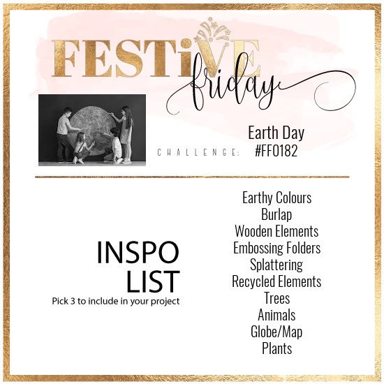
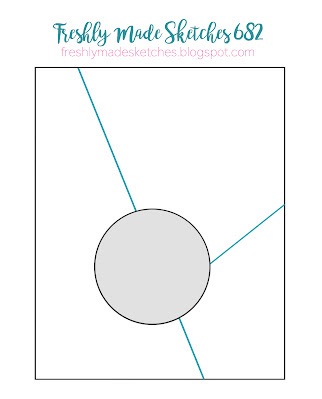
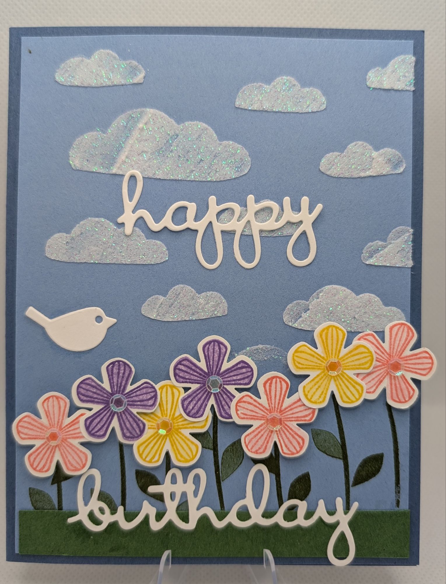
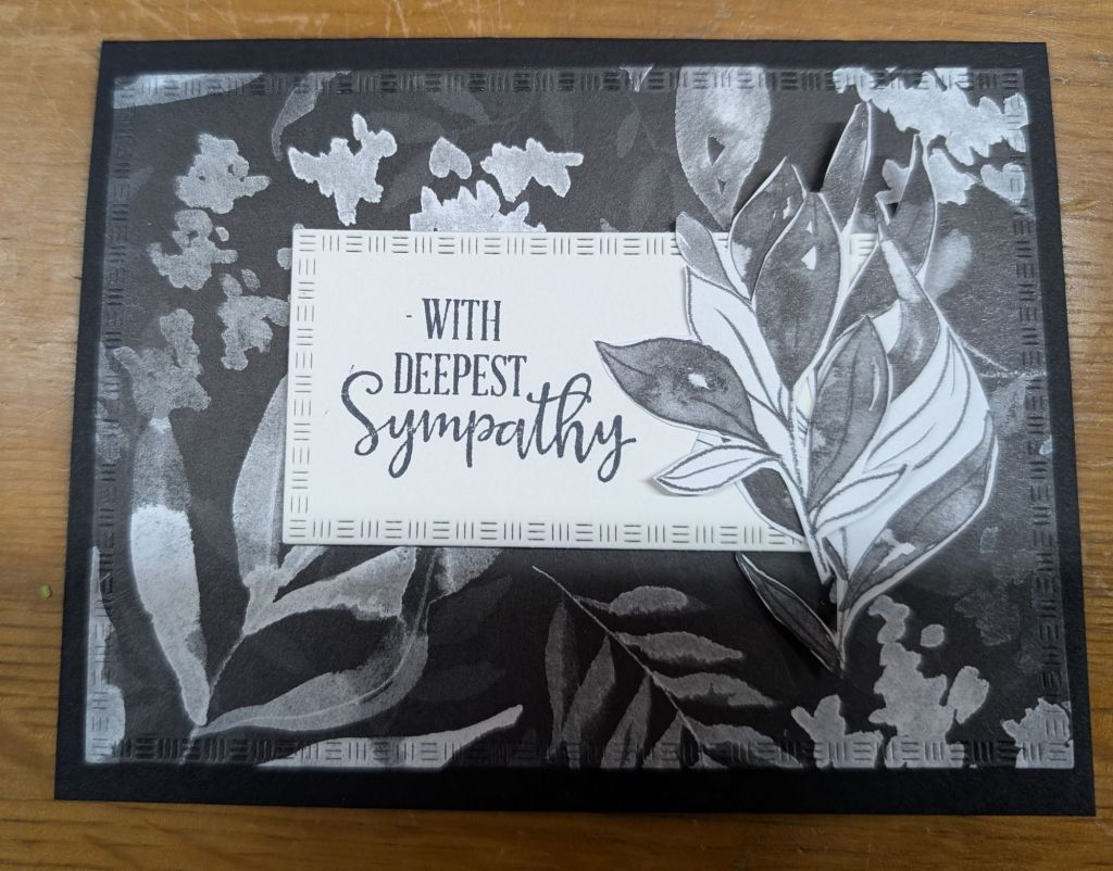
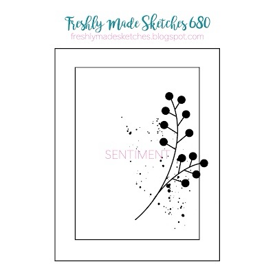
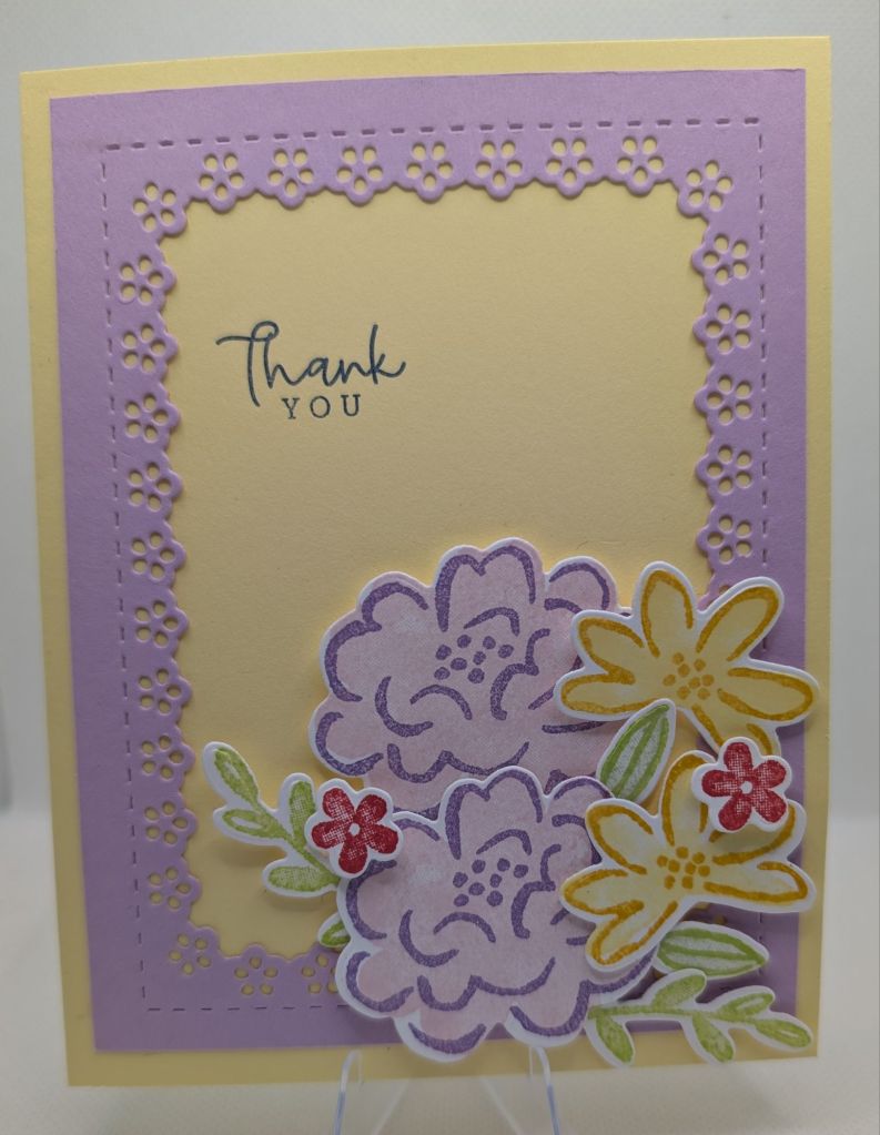
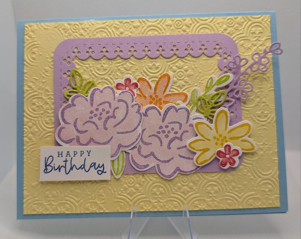
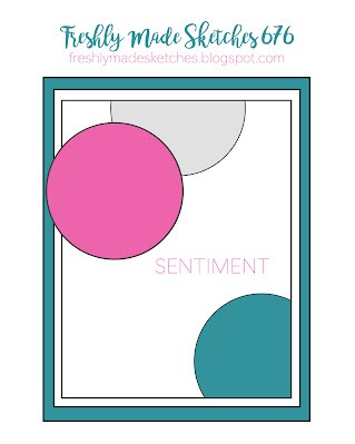
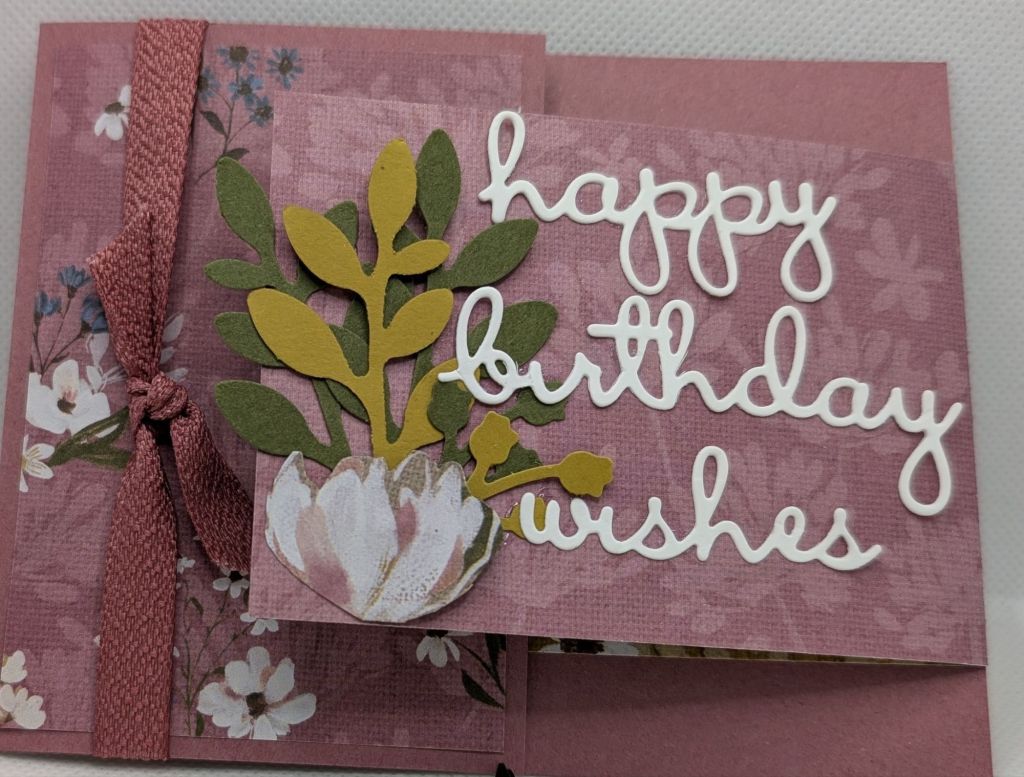
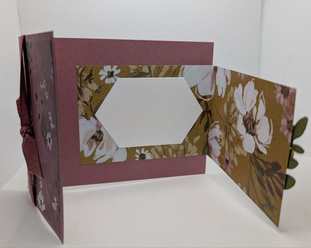
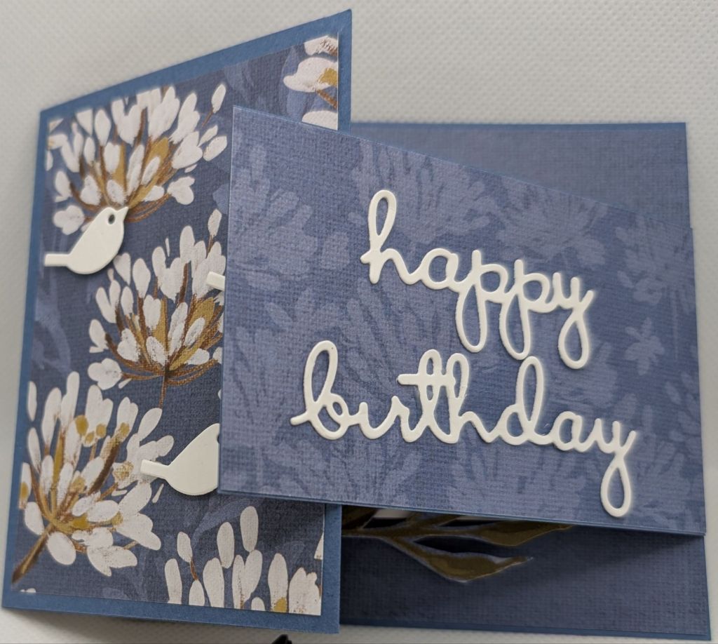
A few months ago, I ordered **something** that came with the neatest thin cardboard wrapping, which I used on today’s card as the background. Now, if i could remember what that **something** was, I would order more for the little cardboard piece! HA! I took some inspiration from the Festive Friday #FF0182 Earth Day challenge with recycled elements, earthy colors, burlap, and wooden elements. The Festive Friday challenge had me scrambling to find that cardboard piece I had saved. Luckily, I found it! Nothing like giving some material a second change, take #2 if you will. The Freshly Made Sketches #682 sketch challenge added some interest to this simple card! The second card took seconds to whip together.

Mossy Meadow card stock base and sentiment, the brown “embossed” cardstock is recycled from packaging from something I ordered in the last few months. The wooden elements are long retired, but still lovely!
Super simple masculine thank you. I need a pile of these, so happy with it!

Fluffy White Clouds

Tic tac toe Tic Tac Toe Challenge TTTC #267 with the row Grass-Die cut-Stencil and Festive Friday Challenge FFO#181 with colors purple-pink-yellow-flowers. I broke out some unopened Shimmery White Embossing Paste and stencils for the clouds. The flowers are punched out (die cut). The grass I cut with SU! retired Fringe scissors. I came across a long retired stamp set Thoughtful Blooms and coordinating small flower punch. The flowers were stamped with these colors for the petal lines: Crushed Curry, Gorgeous Grape, Flirty Flamingo. The flowers were then stamped with these colors for the overall shading: Lemon Lolly, Highland Heather, Pretty in Pink. Grass is Garden Green and the card stock is Balmy Blue (lighter blue) and Misty Moonlight (darker blue). Sentiment and bird from Well Written retired dies. With this card, I just love how the fluffy clouds turned out. Today, the sky above looked exactly like that, the same shade of blue and those fluffy white clouds!

Lemon Lolly and Pool Party full strength for the petal lines and then stamped off once for the overall shading.

Simple Fussy Cutting

It is easy to overlook the simplicity of fussy cutting. From the Botanical Texture Designer Series Paper I fussy cut some leaves from one of the paper designs. Layered on another paper design with the sentiment square cut from the Texture Notes dies from the Botanical Textures Suite. I love the little stitching around the edges of the die cut squares. And each sized square has different stitching around the edges. Oh! This is a current obsession of mine. I was having issues with the black and white cards looking so, well, black and white in the photographs!!!! I took the first card to show some contrast of the brown table and the black and white cards. In the 2nd photo, it looks like it was a card with color that has a black and white filter on it. But really, it is just the paper! I never have enough sympathy cards on hand. This card just looked like a sympathy card to me, so I went with it. The sentiment is from a retired set, Peaceful Moments. I just love the size of the sentiment, so I keep using it.

Showing contrast with table for background.

Pink and Champagne Glimmer

Freshly Made Sketches #680 gave me much needed inspiration this weekend. I was totally feeling the background of scattered “dots” on the right side of the card. I loved the way the image curved around the sentiment in the sketch (below). I was feeling spring colors this weekend, even if spring hasn’t totally sprung yet in Michigan. I have been working through my stash of supplies to either use up materials laying around, or use something I haven’t yet. I came across unopened Shimmery Embossing Paste and stencils I purchased years ago. It made a quick background that you’ll see in a few of my recent cards. Once I had it opened and was making a mess, I just had to make a bunch of card fronts. Keeping with my quest to open unopened items, I decided to play with one of the 2024-2026 In-Colors Pretty in Pink cardstock and Beautiful Butterflies bundle. The butterflies are cut out from the small butterfly dies in bundle on retired champagne glimmer paper. I love the monochromatic card fronts (same color for the card base and card front layer) with the little pop of glimmer paper. Every time I buy a butterfly stamp set and die, I think “This is it. How can Stampin’ Up improve this butterfly?”. And yet they do. Every. Single. Time. So I had to buy this set when it debuted in the Jan-June 2025 Mini-Catalog. The “Thanks” sentiment is from a die a much retired Well Written bundle.

Spring Cleaning

So many times with stamp sets & dies that have small pieces to cut out, I stamp and cut out a bunch of them at once time. Then I make 4 cards and get tired or hungry, and don’t finish using up the rest of the pieces. These pieces are from the retired Darling Details stamp set and dies. I have had these pieces laying around in a little container for years. BUT it is time for spring cleaning in my craft room! I’m getting ready to add some new items from the 2025-2026 Stampin’ Up Annual Catalog coming May 2025. As a demonstrator, there are some items we can preorder. As I don’t have infinite space, I need to use up stash items and look to sell some of the retired stuff I am willing to part with (not as much as I should be willing to part with though!). It’s a start, and I plan to continue working on my retired stash and half-finished projects over the next couple weeks.

Bits of Texture

Unboxing the Botanical Textures Suite, I was excited with the different textures on the Woven Textures Designer Series Paper. All the different textures on the paper are wonderful and it was a little overwhelming to pick a piece to highlight. The Textured Notes stamp set and dies are lovely as well. I love the squares that come with the dies that have stitching around the edges! I will be playing with this suite more, but needed a quick card. Sympathy cards are the hardest to make. I needed some inspiration today and found it with a card challenge. Freshly Made Sketches #676 was the inspiration for this card. I was drawn to the 3 “pieces” to be able to use a few different textures of the DSP.

No Ink!

Looking to get inky, I was perusing different card challenges for some inspiration. None of the sketch or color challenges offered were catching my eye. I was feeling in a “muted” mood; not a bad mood but not a particularly exciting mood. And I wasn’t feeling all the beautiful bright GREEN challenges (my mood wasn’t that good for a gorgeous green card). What did catch my eye was the Seize the Birthday #300 NO STAMPING challenge. So I put my inks away and looked for some dies with sentiments I could cut out. I came across a very retired set of dies and eyed up my stash of white card stock scraps. Yes, I would do white card stock sentiments. Now, to find some designer series paper to play with! With the 2023-2025 In Colors retirement in 2 months, I figured I should get to using them up. Yes, Moody Mauve was bringing me all the creative feels today! From the Stampin’ Up Annual catalog, I pulled out the Wildflowers Designs stamp set and dies, and Wildly Flowering designer series paper. I was drawn to the muted colors of this DSP, Moody Mauve, Misty Moonlight, Wild Wheat, Mossy Meadow, Crumb Cake, Early Expresso. Now, the Wild Wheat has not been a color I have reached for often. But it is a perfect accent in this paper! I went for a Double Flap fold design to be able to show off a few different patterns of the paper. The card base is 4.25 in x 8.5 in, scored at 5.5 in to give a 4.25 in x 3 in panel. The overlapping panel was not a particular size, just a long skinny scrap of card stock or DSP. I fuzzy cut some flowers from the DSP for decorative elements. The leaves are from the Bough punch. I found retired Moody Mauve and Misty Moonlight ribbon to add a little more to the cards. With the sentiments, I did not use adhesive sheets prior to cutting out the words, which would have saved me from getting glue everywhere! I had to wash my hands 8 times to get the glue off, and I had glue on my sleeve! ARG! Then, I had those little words glued to everything BUT THE PAPER!! I would put glue on and stick the word to the paper, then it would be stuck to my arm or the cat in a matter of seconds. ARG! What a mess. Anyway, I love how these cards turned out, so I will be making more just like this WITH ADHESIVE SHEETS for adhering the words to the paper and not to everything else (including myself and the cat)! Don’t ask me why the cat is in my craft area, that’s another story!

Best Kind

I have falling in love with the “You’re the best kind of person” sentiment in the Citrus Blooms stamp set/dies. I may have went overboard with cards featuring the Mediterranean Blooms suite, but I just couldn’t stop! The die cuts available in this set also caught my attention, as well as the coordinating Mediterranean Blooms paper.

For this week’s Tic Tac Toe challenge #TTTC264, I chose the row down the middle with Kraft Cardstock-Die cut-Ink/Markers/Colored Pencil. I colored the die cuts with Blender pens and Pumpkin Pie/Lemon Lolly/Garden Green inks, on Shimmer paper (retired SU!). I didn’t trust myself with true watercoloring, so I used the Blender pens, which are easier for me to control.The orange blossoms, orange/leave/blossom combos, as well as the Garden Green card stock leaves are all cut outs with the dies in this bundle. The combination of Crumb Cake base (Kraft) and Night of Navy patterned paper is so classic. I had made the cards with white card base first, then tried the Crumb Cake cardstock. I like the cards with the Crumb Cake better!

I love the rounded corners on this card!!
I don’t always do layers in interest of cost, but I do love this card!

Triangles

I was looking for different shapes for the fronts of cards without getting into fancy folds. The triangles are little bit harder than just cutting squares, but they look so much more interesting. I need to look for triangle dies!!!

Darling Spring Flowers

Here in Michigan, the color of spring around my house is still kind of brown (mud, bare trees), grey (sky, clouds) and brownish-green (grass, sprouting plants). Those are not the colors I usually think about when I think of spring! I think of all the soft and light pinks, purples, blues, yellows, greens. My memories of spring are surely more colorful than the actual Michigan spring outside my window! So despite all the drab, dark, colors surrounding me right now, I was inspired by the Seize the Birthday Challenge #280 “Spring Florals”.

The flower cut outs and frame are from Darling Details stamp set and coordinating die set. I used colors Sweet Sorbet, Bubble Bath, Gorgeous Grape, Fresh Freesia, Lemon Lolly, Crushed Curry, Parakeet Party, Garden Green, and Balmy Blue.